Joe Lanman - Designer
Petition Parliament

UK Parliament’s old ‘e-Petitions’ site was tired, hard to find and crucially not mobile-friendly. In a world of social media and smartphones, competitors like Change.org were far more popular. This was a shame because e-Petitions were officially monitored and could be discussed in Parliament if they were successful.
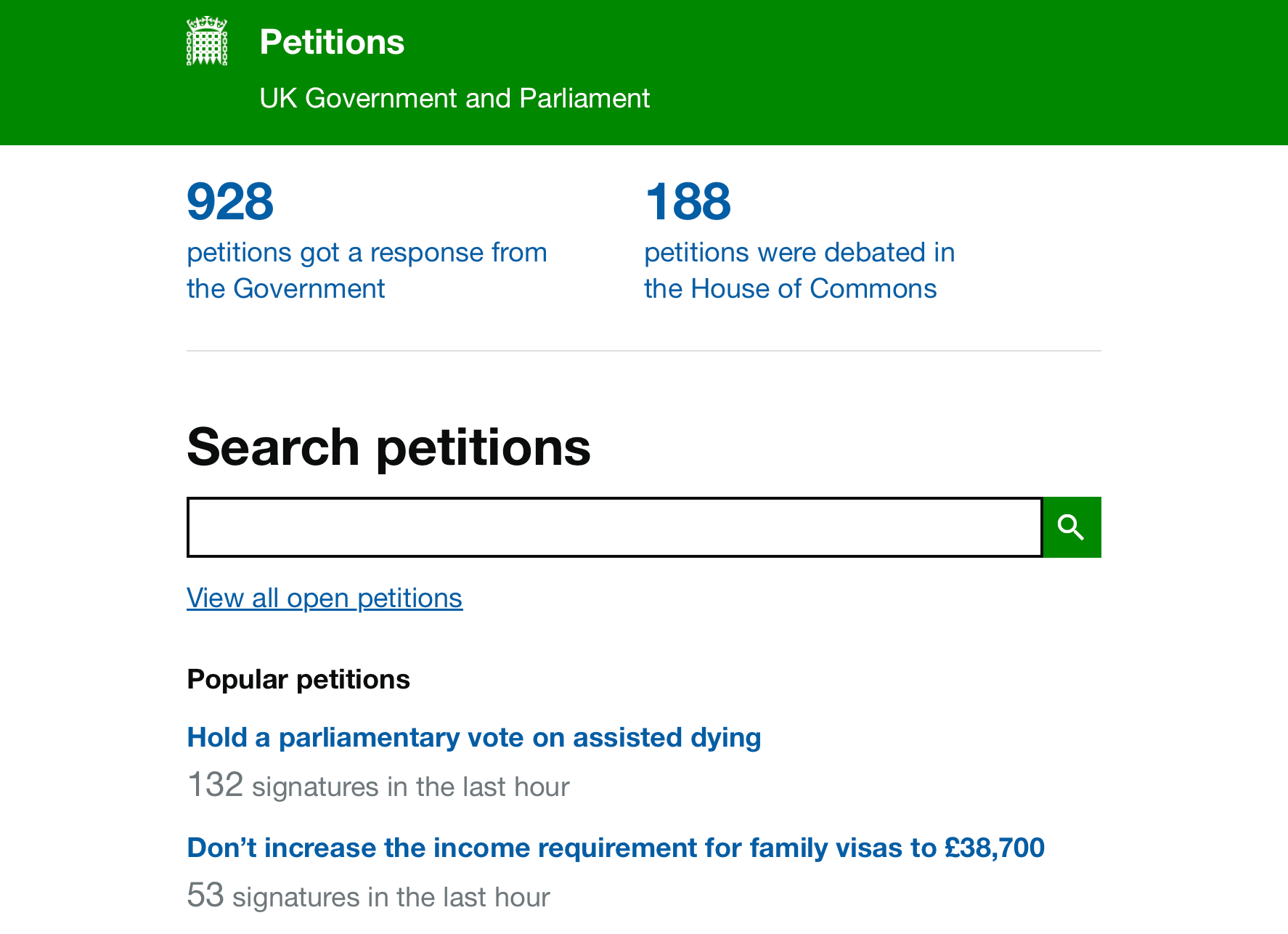
We redesigned and rebuilt the site from scratch, designed for mobile first.
Usage increased dramatically - about 4 million people every month, or 10 million if there’s a particularly popular petition!
My role
As part of a multidisciplinary team, I led the service and interaction design. Some examples of my work includes:
-
Working to clarify and simplify the service design. I pushed to rename from ‘e-petitions’ to Petition Parliament. We made the unique advantage simpler and clearer - that every petition with 10,000 votes would get a government response, and 100,000 votes would be considered for debate in parliament
-
Mobile-first interface design. Often a good idea, but especially here as we knew from research that the majority of petition traffic comes from social media, on mobile or tablets.
-
A new pattern to check if your email address is correct. Tests on the previous site had shown that significant numbers make an error in their email address. Without it their vote doesn’t count. This new pattern is both less annoying than typing it out twice, and more effective.